Customizing your Candidate record overview layout
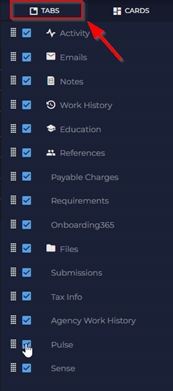
Access Candidate and Adjust the Overview layout by clicking on the Layout Button
Unchecking any of the categories under tabs will remove that tab from the top of the candidate record (see below for before and after screenshots)
Before adjustments
After unchecking Education, References, and Pulse (you can customize this to what works best for you!)
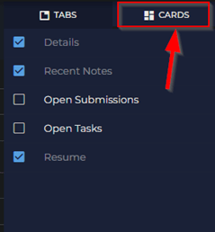
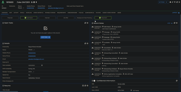
Under Cards in the Layout Button you will find more options to check or uncheck depending on what works best for you. (see below for before and after screenshots of how this looks in the overview of the candidate)
Before
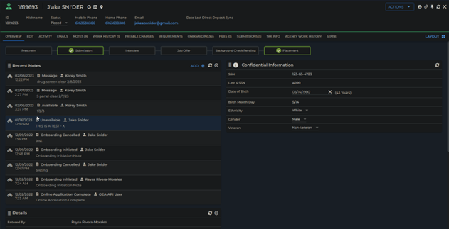
After
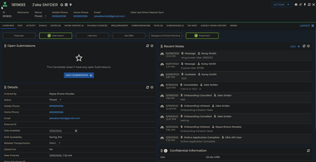
These Cards can be organized however you want them to be by clicking and dragging them to the desired location on your screen. In the below screenshot I moved the notes section to the top right-hand side of the candidate record.
**Please note that you can customize most card layouts in Bullhorn (Candidate, Company, Contacts, etc.)


